So your website is search engine optimized, your search rankings are up there and you’re scratching your head wondering where your sales are at. Just because consumers visit your website, doesn’t mean they will spend. In this blog post we look at how you can help your customers push their cart to your checkout.
Make your value proposition clear
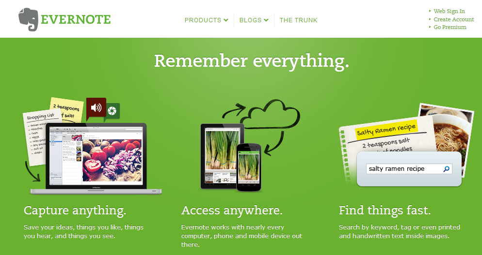
It should be clear to visitors of your website what you do and the benefit it has to them. Evernote is a great example. The value proposition is short and simple and the benefit is very clear, just two words. ‘Remember everything’.

Use clear calls-to-action
Use trigger words to get the visitor to take action. Sephora tell the visitor it is the ‘last chance to shop the sale’. Call you call-to-action as it is. The ‘shop the sale now’ button is exactly that, a link to shop the sale. If it is a download, use ‘download now’. Add benefits to add punch to your call-to-action. Sephora below tell the visitor new products have been added, so even if they have been to the sale section of the website, they are given a reason to click again. Add some urgency. If it is an offer, give the time frame. In this case, the visitor is told, ‘online only’ and ‘limited quantities’ with the link to the action required directly below.

Give good product information
While consumer purchase decisions are influenced by other consumers, the information you have on your website is also required to reduce purchase uncertainty. Use high quality images and even better, multiple images. The customer cannot hold the item like they can in store so you need to give them quality information.
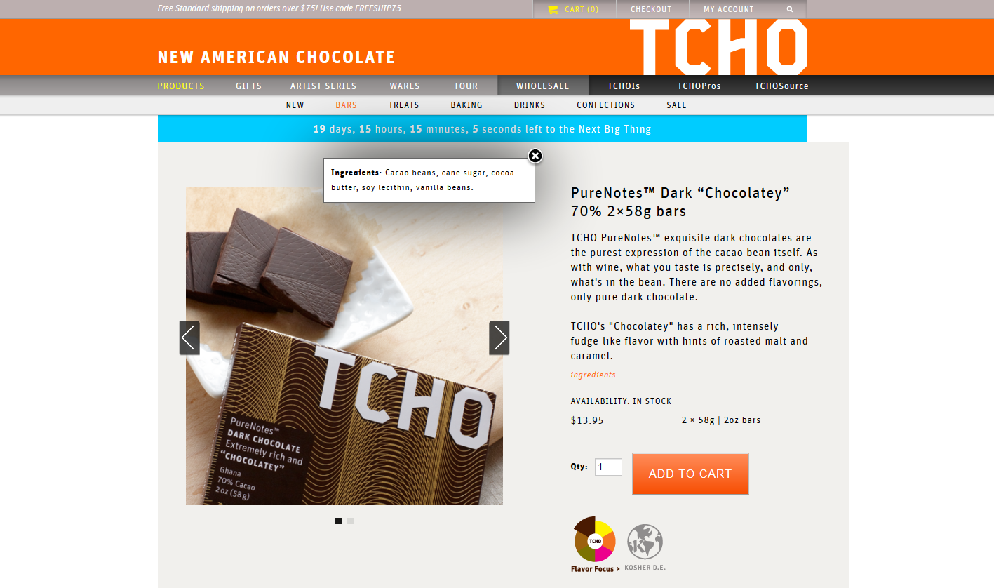
Tcho provide an excellent example of how to do it right. The layout is simple, clean and accessible. Rather than just using an image of the chocolate in the packaging, Tcho use an image of the actual chocolate. For the emotive types, there is a flavour profile description and for the rational thinkers, product weight, cacao percentage and price. Click on the ‘ingredients’ link and a small box appears listing the ingredients. A beautiful, well designed website that helps customers fill carts with chocolate.
Offer guest checkout
Forcing people to create an account will decrease your conversion rate. It doesn’t matter if your website is well designed, delivering an exceptional online shopping experience requires the checkout process to be ridiculously simple. Remove the barrier to online purchasing by removing the need for customers to create an account. ASOS halved their cart abandonment rate by removing the mention of creating an account.
Make the checkout process simple
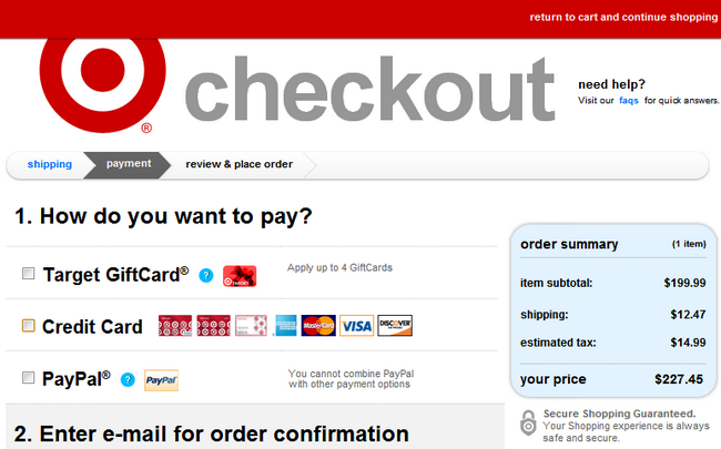
Single page checkouts outperform multiple page checkouts by 21.8%. Don’t ask for too much information and don’t ask for information twice. Shorten the process by pre filling information for customers so they don’t have to go through the tedious task of re-typing it. If your checkout process has multiple pages, take a cue from Target and offer a clean progress indicator of the checkout process.

Reduce the risk to buy
Reduce purchase uncertainty by providing visitors to your website with the information they need to make a purchase decision. Provide detailed product information and images. Consumers influence other consumer’s purchase decisions, facilitate this by including social sharing buttons on all your products and include product reviews if your website supports a review submission process. Unlike brick-and-mortar stores, an online customer has to wait for their purchase. Provide shipping information and expected delivery times. Two thirds of customers are influenced by free shipping offers so if you can offer free shipping, do it. Add your return policies and make it easy to understand. A comScore report also finds that 63% of customers look for a returns policy before making an online purchase.
Make the shopping cart visual and easy to edit
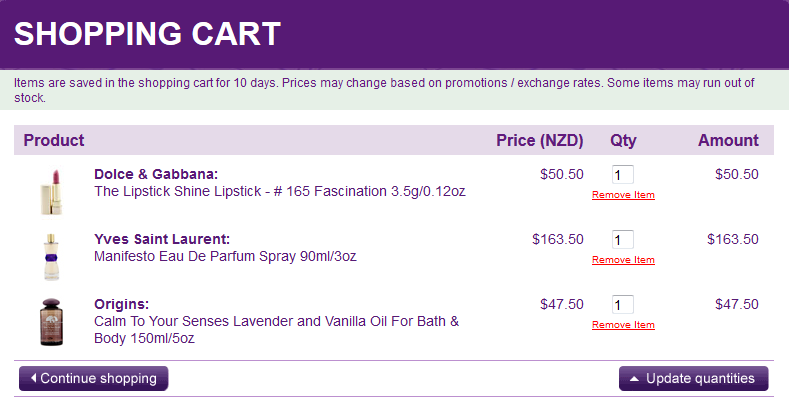
Use images to visually remind customers what is in their shopping cart like Strawberrynet do. Links are also included so that if the customer needs to go back to reconfirm their choice, navigation is easy. Provide a ‘remove item’ link and the option to increase product quantities within the shopping cart. The ‘update quantities’ automatically adjusts the order making cart editing a breeze and shortening the checkout process.

Be upfront
Unexpected taxes and shipping costs are the number one reason for shopping cart abandonment. To overcome this issue, ask for shipping information before billing information. It is more important to the customer to determine these costs before entering their payment information. Design your checkout flow with customer priorities in mind.
Be authentic. Help them trust you
Providing contact information, including a physical address, phone number and other contact details establishes credibility with the consumer. Make the contact information visible, if they can’t find it, they will leave and display security icons prominently so the visitor knows their information is safe with you.

 Tcho provide an excellent example of how to do it right. The layout is simple, clean and accessible. Rather than just using an image of the chocolate in the packaging, Tcho use an image of the actual chocolate. For the emotive types, there is a flavour profile description and for the rational thinkers, product weight, cacao percentage and price. Click on the ‘ingredients’ link and a small box appears listing the ingredients. A beautiful, well designed website that helps customers fill carts with chocolate.